Most organizations do not fail because they lack a logo. They fail because they mistake a logo for a brand.
Over the years, I have seen organizations invest significant budgets in visual identities, launch campaigns, redesign websites, print beautiful stationery, and publish comprehensive brand guidelines—only to discover that nothing meaningful changed.
Recognition did not improve, trust did not increase, perception did not shift, the market remained largely indifferent.
The problem was never the design itself. The problem was the belief that visual identity alone could solve strategic problems.
A brand identity is not a decoration applied to an organization. It is the visible expression of how an organization thinks, behaves, communicates, and creates value.
When that foundation is weak, even the most beautiful identity eventually fails.
The First Mistake: Designing Before Defining
One of the most common reasons brand identities fail is that organizations start with visual design before answering fundamental strategic questions.
- Who are we?
- Why do we exist?
- What makes us different?
- What should people remember about us?
- How do we want to be perceived?
Without clear answers, designers are forced to create visual solutions for strategic problems that have never been properly defined.
The result is often attractive work with no real meaning behind it.
Imagine designing a building without knowing whether it will become a hospital, a school, or a hotel. The structure may look impressive, but eventually its purpose will be questioned.
Brand identities work the same way. Visual expression should emerge from strategic clarity, not replace it.
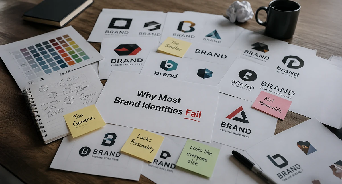
The Second Mistake: Copying What Everyone Else Is Doing
Many organizations unintentionally build identities based on trends rather than truth. They see successful companies using minimalist logos, geometric typography, monochromatic color palettes, and modern websites. Naturally, they want the same. The problem is that trends create similarity, not distinction.
When every technology company looks like every other technology company, differentiation disappears.
When every luxury brand adopts the same visual language, uniqueness becomes impossible.
A useful exercise is to place ten competitors side by side. In many industries today, removing the logos would make it difficult to identify which brand belongs to which company.
That is a warning sign.
Strong identities are remembered because they reflect something authentic about the organization, not because they follow current design fashion.
The Third Mistake: Confusing Consistency With Repetition
Organizations often believe consistency means applying the logo everywhere.
- The logo appears on presentations.
- The logo appears on social media.
- The logo appears on business cards.
- The logo appears on signage.
Yet the overall experience remains fragmented.
True consistency is not repetition. True consistency is alignment.
It is when the tone of voice, customer experience, visual language, messaging, behavior, and decision-making all reinforce the same perception.
People rarely trust organizations because they use the same logo repeatedly. They trust organizations because every interaction confirms the same promise.
Consistency is a behavioral discipline before it becomes a visual discipline.
The Fourth Mistake: Treating Identity As A Design Project
Many organizations launch a branding initiative with a clear beginning and end.
- Research.
- Design.
- Approval.
- Launch.
- Done.
The identity becomes a completed project rather than an ongoing system.
This is where many brands begin to deteriorate. A successful identity is not a static asset. It is a living framework that must adapt across new campaigns, digital platforms, products, services, events, publications, partnerships, and future growth.
Without governance, the system gradually breaks apart.
- Different departments create their own versions.
- Different vendors interpret the identity differently.
- Different teams communicate in conflicting ways.
- Within a few years, the original clarity disappears.
The strongest organizations treat identity as an operational system, not a design deliverable.
The Fifth Mistake: Ignoring Internal Audiences
Many branding efforts focus entirely on external perception.
- Customers.
- Partners.
- Media.
- Stakeholders.
But the people who determine whether a brand succeeds are often the employees themselves.
If employees do not understand the organization's purpose, values, and positioning, they cannot communicate them consistently.
The strongest brands are often built from the inside out.
- Employees become ambassadors.
- Leadership reinforces the message.
- Departments share a common language.
- The identity becomes part of organizational culture rather than merely a marketing asset.
A brand cannot be consistently experienced externally if it is not consistently understood internally.
The Sixth Mistake: Prioritizing Appearance Over Meaning
Modern branding has become increasingly visual.
- Social media rewards aesthetics.
- Design showcases highlight visual style.
- Organizations often become obsessed with how things look.
- Yet audiences ultimately care about meaning more than appearance.
- People remember clarity. They remember usefulness. They remember trust. They remember experiences.
Few customers choose a company because its logo is perfectly designed. Many customers choose a company because it consistently solves their problems and communicates clearly.
Visual identity should amplify meaning, not substitute for it. When appearance becomes the strategy, the brand becomes fragile.
The Brands That Endure Think Differently
The most successful brand identities are rarely the most complex.
They are the most coherent.
- Every element works together.
- Purpose informs strategy.
- Strategy informs communication.
- Communication informs design.
- Design reinforces experience.
- Experience strengthens perception.
- Perception builds trust.
- Trust builds value.
That chain is difficult to break because every component supports the others.
The visual identity becomes powerful not because it is visually impressive, but because it accurately reflects something real.
A Better Question
Organizations often ask:
"Do we need a new logo?"
In many cases, that is the wrong question.
A more valuable question is:
"Do we have a clear and consistent way of communicating who we are, what we stand for, and why we matter?"
If the answer is NO, a new logo will not solve the problem. If the answer is YES, the visual identity becomes far more than a logo. It becomes a strategic communication system.
And that is the difference between a brand identity that simply looks good and one that creates lasting value.
Final Thought
Most brand identities fail because they are designed as visual exercises rather than organizational systems.
The organizations that succeed understand something fundamental:
Design does not create meaning. It reveals it.
When identity is built on strategy, purpose, behavior, and clarity, it becomes more than a collection of visual assets. It becomes a shared language between an organization and the people it serves.
And that is where real branding begins.